|
Combination #1: Beige -Choose a delightful warm colour- such as IVORY RIDGE by Plascon- that can lighten up any room with soft class. Like a light mint hue and tone hidden by a cotton appeal. Any dining room will look great in this sort of colour when combining this colour with another such as the one listed below. Greens -A great second colour combination to an Ivory tone is a green as it does not only offer a deeper tint of the above, it also offers character to any dining room. It is not a deep green; it is a combination of mist and the softest of greens; try KALAMKARI by Plascon. To add a little colour, try SEA SPHINX by Plascon for edges or picture rails Give your dining room a touch of class, and go for this combination. | 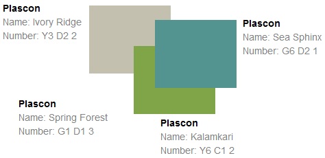  |
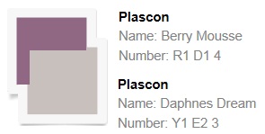 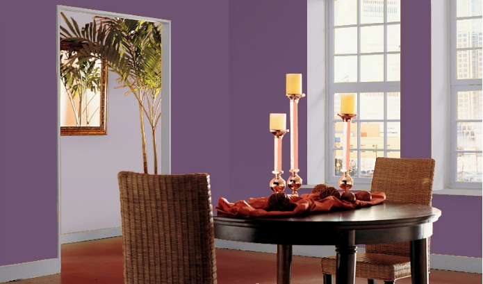 | Combination #2: Grey-Frost never looked so sweet than in this light grey hue and tone, try DAPHNE’S DREAM by Plascon. As light as Baby's Breath itself, this colour offers class with a sweet touch of cotton cascade. Purples- Purple or mauve is a great colour combination with DAPHNE’S DREAM. Nothing looks more beautiful than DAPHNE’S DREAM and BERRY MOUSSE when painting your dining room. |
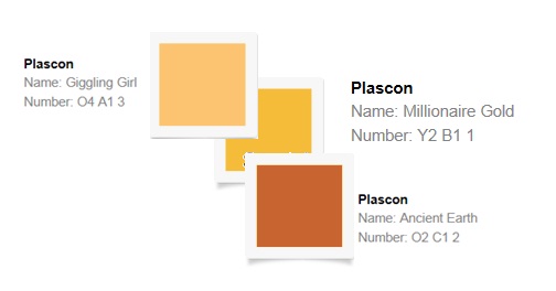
Combination #3: Oranges- not only do they sound attractive, but they look it too. Class in the dining room can be reached with the use of corals such as GIGGLING GIRL by Plascon. This luscious paint colour reflects silky pastel, one of a kind. In a combination, corals offer the chance to work with other colours. Great for those who like to mix and match in the dining room. Browns- sounds strange, but that is far from the truth. A light pastel type tan mixed with a cotton tone for soft reflection is the best way to describe the browns. Browns go well with oranges and corals. Treat your dining room with the best that paint stores offer, go for the lighter colours with excellent hues and tones. Try ANCIENT EARTH by Plascon Gold’s- When trying to offer some gold hues and tones use a colour such as MILLIONAIRE GOLD by Plascon. It is better to not connect gold hues and tones with other colours unless you are planning on using a soft cotton colour to match.  | 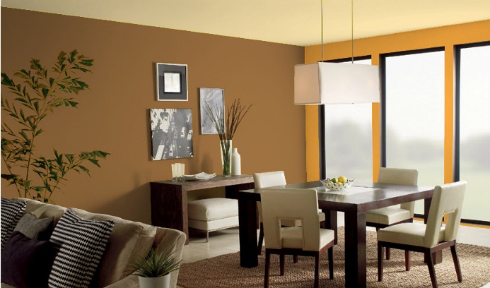
 |